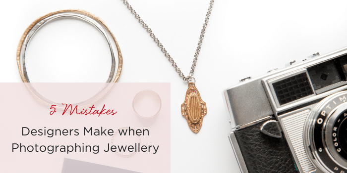
5 Mistakes Designers Make when Photographing Jewellery
This is a guest post by Jess Van Den, the maker of Epheriell jewelry & the founder and editor of Create & Thrive, the site where you can learn how to turn your handmade hobby into a thriving business from those who've done so. I've been photographing jewelry since I started selling my work online in 2008, and when I first started out, I knew NOTHING about it. It took me many years of trial, error, practice, and education to start taking photos I'm proud of. Of course, I plan to keep learning and trying new things, but I've learned a few things about avoidable photography issues.
Today I want to share 5 of these mistakes that I see jewelry designers making over and over again in their indoor and outdoor photographs.
Main image not cropped for detail
If you're selling a necklace where the pendant is the main attraction, don't make your main image a shot of the whole necklace. The detail in the pendant is what will really draw the customer's eye – so make sure that your main product image is a closely cropped shot that shows the beautiful detail in your piece. Use your additional product photos to show the design as a whole. The same goes for any other large piece! Choose the part that really stands out to focus on in the main image.
Not showing it on a model
You have a close-up shot, a whole image shot… even shots showing the back of the piece. But you're missing a crucial photograph: your item on a model. Don't underestimate how important this image is to your customer. Not only does it ‘humanise' your jewelry, it also gives an immediate sense of scale. When we're looking at small items of jewelry blown up at huge resolution on our computer monitor, we can get a skewed sense of the size of the piece. Showing it on a model eliminates this problem immediately. Plus, it's a great opportunity to extend your branding with the style of model photo you use.
Over-exposure on white backgrounds
White backgrounds are commonly used when photographing jewelry. Personally, I'm not a fan, except for wholesale catalogue and press-ready images. But even with a plain white background, the framing, angle, and editing of your image can make or break it. I can't count how many times I've seen an overexposed photograph of jewelry on a white background. This leaves the whole image looking washed out, and sometimes it can even blend into the background, especially with silver jewelry. So, be careful that you're not over-lighting with a strong lightbox, or over-editing your jewelry images. You need that contrast!
Pin me below to share with your friends!
Busy backgrounds
Let me guess. You want your photographs to reflect your unique style (like I do) – but your jewelry should still be the star of the show. Don't get so excited adding styling and branding elements to your photos that your jewelry ends up blending in. Strategic styling through the use of props can work really well… or it can tip your best photograph over into disaster. The first question to ask yourself if you're afraid you've done this is, “If I didn't know what was for sale and I saw this picture – would it be obvious?” That might sound over-simplistic, but it's the most important test – one that many jewelry designers fail.
Unflattering angles
A truly breathtaking product photo not only shows your jewelry clearly, but it also tells a story. It evokes an emotion. It draws the customer in because they just HAVE to find out more. Photographing jewelry in its best light is all about finding the angle that best catches the light, and the eye. Don't just lay it out clinically and photograph from the front. Again – this is fine for a wholesale catalogue, but for selling online and for advertising and branding purposes, your shots should have personality. There are so many things to learn when it comes to photographing jewelry. These are just a few key elements of truly fantastic, eye-catching photography that will sell your work.
What are your biggest challenges when it comes to photographing your work? I'm happy to answer any questions you might have in the comments.
Do you want to learn how to take truly stellar product photos? Then you need the Create & Thrive Guide to Product Photography, written by professional photographer Jeffrey Opp. It's a plain-English, easy-to-understand guide for the beginning to intermediate product photographer. You can also grab a FREE copy of Jeffrey's step-by-step guide to crafting your own ‘studio-in-a-box' here.
