How to Create a Clean and Simple Website that Sells

Over the past several years, our society has slowly but surely been replacing consumer culture with a welcomed minimalist movement.
As consumers in this new movement, we want our personal style to reflect careful and thoughtful purchasing decisions. We see the value in how makers present themselves online. We like to know exactly where our money is going and how our purchases are being made. “Minimal” in this sense means “essential”. It is reflected not only in our wardrobes but in the visual designs through which we buy and sell. Let’s talk about how this minimalist approach can be applied to one of the most important aspects of your business: your online storefront.
When it comes to building an online jewelry store, making simple design choices is critical. Simplicity not only serves as an aesthetically pleasing way for you to present your company and brand, but it will actually facilitate your shoppers’ buying process by helping them zero in on your designs and leading them through a carefully curated sales path.
So what are these simple design choices exactly?
Color Scheme
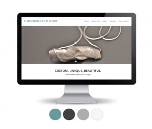
When selling jewelry, it is important to keep your visuals simple so the jewelry can speak for itself. Use black and white throughout your site, and one bright accent color for a call-to-action. If you’re not a fan of black and white, try variations of the classics. For PJ O’Connor Jewelry Design’s website, we used a charcoal and a slight off-white to maintain the same, simple aesthetic but offer a softer perspective.

Font Selection
Your website really only needs one or two (max) fonts. Some fonts come with multiple style options, which will allow you to use the same font in different styles throughout your site. You’ll notice the effectiveness of this approach with Factory45.co, a website I designed for an accelerator program for USA-made products. We used two fonts throughout the entire homepage of the site, cleverly playing with size and style to make sections and words stand apart from one another. This general cohesiveness and simplicity throughout copy will contribute to the minimalist design aesthetic you’re going for. Work with a designer to play with line height, letter spacing and font size. They might seem like miniscule matters, but overall, will help the legibility of the page and quality of the design.

Imagery
Don’t be afraid to get up close and personal with your pieces. Whether it means purchasing a good camera or working with a photographer, take hi-res shots of your jewelry so that you can display clean and clear close-ups of your pieces as full width images throughout your site. This is how your customer needs to see your jewelry and how your web designer wants to receive your images.
Also, remember to remain consistent with your images. If you’re shooting your pieces with a white background, shoot them all with a white background. Cohesiveness brings cleanliness and professionalism to your brand’s aesthetic.
People shop online for convenience. We no longer subject ourselves to the crowds, the parking and the overwhelming experience of the American shopping mall. Remember the nightmare of uptight salespeople, obnoxious displays and waiting in line? You do, and you have the opportunity to create the opposite effect with your website.
Remember the early days of e-commerce with the cluttered designs, low quality photography and pages upon pages of SEO copy? Again, you have the opportunity to create the opposite effect with your website. Remember why people will buy your pieces online: It will be easy and it will be simple. They will focus on your craftsmanship and the story behind their purchase. The internet is a virtual goldmine (pun intended) for jewelry sales, so let your creations be the star of the show. Embrace simplicity. Less is more, and more sales for you.
We want to hear from you! In the comments below, tell us the following:
What is one change you can make on your current website right now that will significantly simplify it?
Emily Belyea is a brand strategist and web designer that works with creative entrepreneurs. Her specialty is creating clean and simple online homes that help her clients showcase the true value of their work in the most impactful way possible. You can view her work and more at emilybelyeacreative.com.
Website: www.emilybelyeacreative.com
Facebook: www.facebook.com/emilybelyeacreative
Instagram: www.instagram.com/emilybelyea
LinkedIn: www.linkedin.com/in/emilybelyea/


