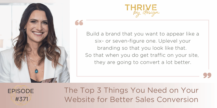
EP371: The Top 3 Things You Need on Your Website for Better Sales Conversion

When you’re building a brand, you want to appear like you’re a 6-figure brand, even if you’re not.
What I mean is, you want people to take you seriously.
Think of your website as your brand’s first impression. If you’re getting traffic but still struggling to make online sales, it might be time to take a look at your site.
Low-quality images, busy design, and confusing interfaces are enough to turn a “yes” into a “no way” when someone’s interested in your product.
As we’re gearing up for the holiday season, let’s talk about the top 3 things you need on your website for better sales conversion.
Guide Your Customers With Clear Calls To Action
Business owners overlook this all the time.
You land on someone’s website, and you’re hit with a ton of beautiful images, but there aren’t any buttons to take you to the products. After some scrolling, you give up and close the browser.
Clear calls to action are really important for your website. If people don’t know what to do, if they get confused, they’re going to bounce real quick.
Your first priority should be getting people to shop for your products. Your second priority should be getting people on your email list. Everything else is just a bonus.
Every image should be accompanied by a button or link that shows the visitor where to find the products they’re looking at.
Answer People’s Questions Before They Ask
Your website should be set up to overcome objections. That means you understand the things that might make someone hesitant to buy, and you’re getting ahead of those things as soon as possible.
People are asking you questions all the time…
- What’s your return policy?
- How long will shipping take?
- Do you offer custom work?
- What size is right for me?
Etcetera, etcetera. While it’s great when people shoot you a DM to get an answer they need, most people won’t be willing to put in the effort.
Having an easy-to-find FAQ page on your site will help people effortlessly get the answers they’re looking for when they’re deciding to make a purchase.
Design Your Website Like A 7-Figure Brand (Even If You’re Not)
I’ve met incredibly talented designers who struggle to get sales because their website is scaring customers away.
It doesn’t matter how beautiful your jewelry is, if you have low-quality photos and a cluttered, frustrating website, people will never buy.
That’s why I always encourage independent business owners to use a platform like Shopify, which has professional looking templates that are easy to use, even if you don’t know how to code.
Your web design represents your brand, so make sure it represents it well.
Listen to the full episode above for an in-depth dive into each page of your website and what you should include to improve your sales conversions.
xo, Tracy
Links:
End The Year Strong With Marketing That Matters
More Resources for Jewelry Designers

